Note: This publication will print out to about 20 pages and has
17 photos/graphics that might take a few minutes to download.
A Practical Guide for Developing Marketing Brochures for Heritage Tourism and
Interpretive Sites & Attractions.
JVA Technical Bulletin #99-1
By
John A. Veverka
Does this get your attention?
If it is to be a successful marketing piece it better! There is more to developing a
successful interpretive or marketing brochure than you might think. The planning
process begins with "first impressions", and works its way through content,
colors, photos, and more. It involves a real understanding of the psychology of the
audience, and in understanding what they might be looking for in a heritage attraction.
This guide is designed to give you an overview of some of the
key considerations in developing "successful" marketing brochures. Not
that you may be the designer yourself, but you must be an informed consumer. I will
give you a checklist of things to consider in developing your market pieces, and how to
help your designers create successful and market friendly brochures.
Planning your heritage site
marketing brochure.
Developing your theme.
The planning model I use for developing interpretive brochures (or any interpretive
product) begins with the story. What is the topic or message that I need to present and
what is the THEME that the piece needs to illustrate. A theme is a complete sentence that
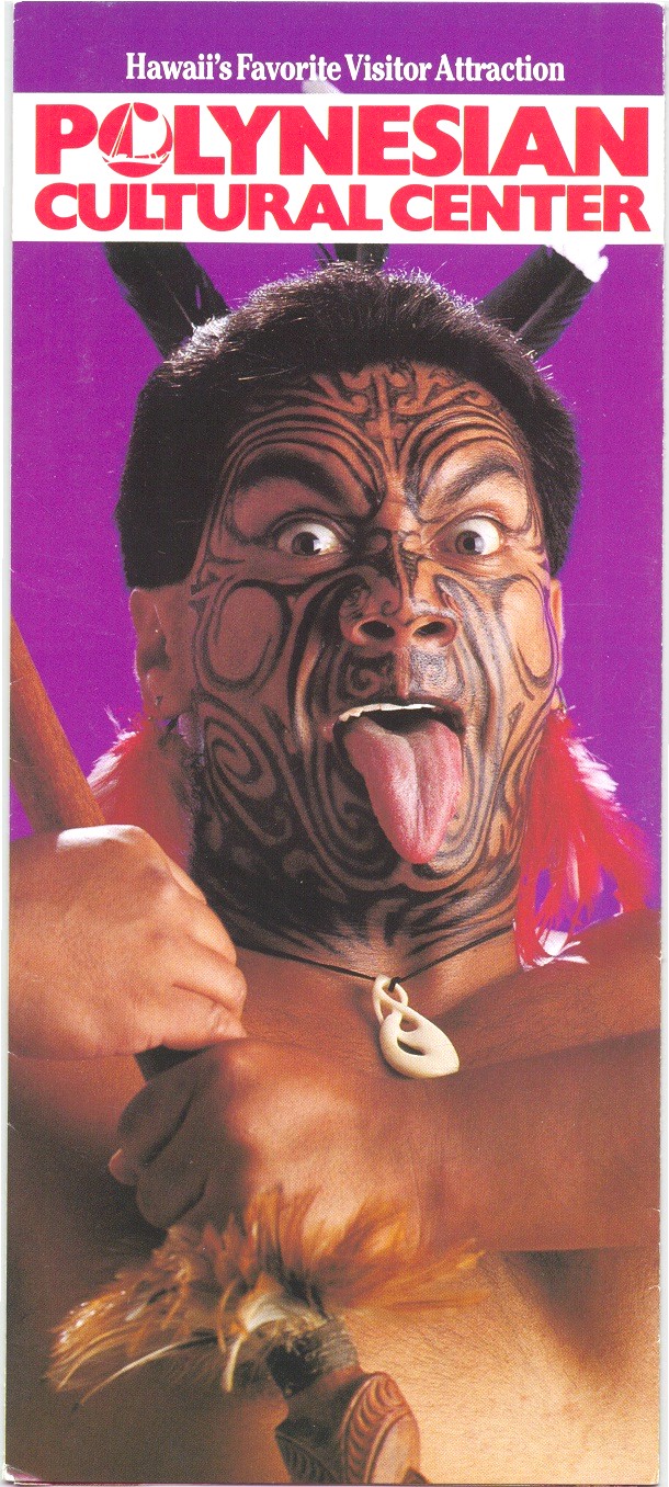
captures the essence of the total site story. The theme for the brochure above seems to be
that "The Polynesian Cultural Center is Hawaii's favorite visitor attraction".
The content of the brochure then continues on the inside to illustrate to the reader
"WHY" this statement is true.
Take a look at the next brochure. Can you tell what the main theme (or tourist story
presentation) might be?
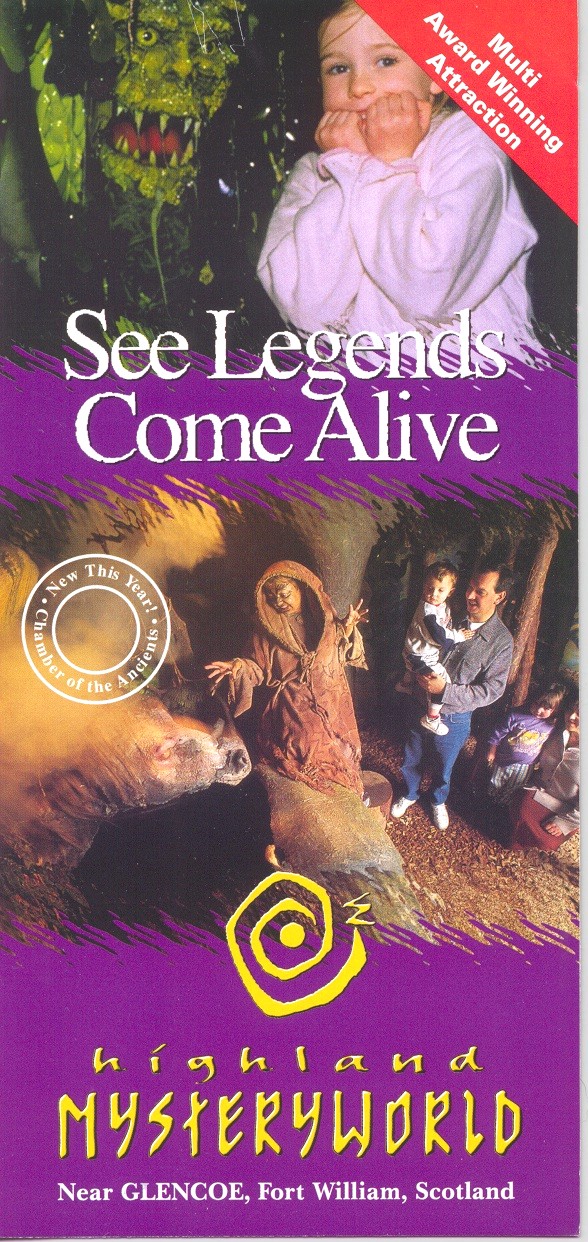
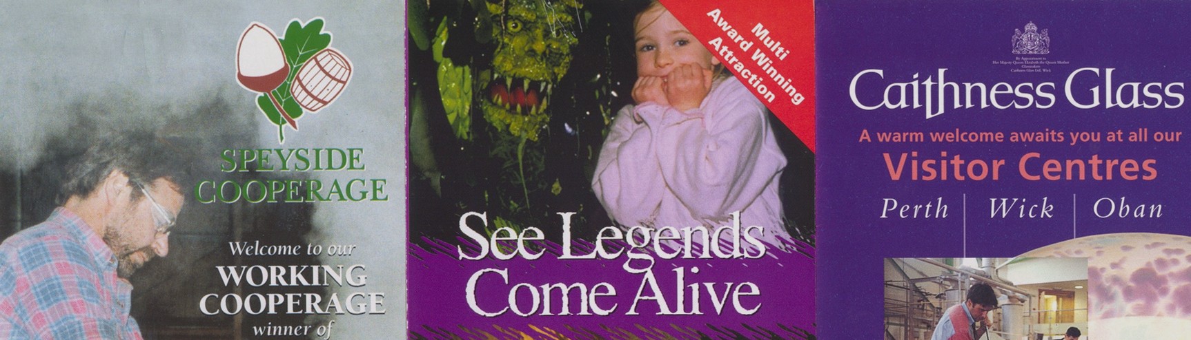
This is one of my favorite heritage tourism marketing brochure
covers (front page). It does several things. First, it clearly states what the
main theme of this attraction is "At Highland Mysteryworld you
will see (Scotland's) legends come alive". This
theme statement is very well illustrated by the photos on the cover (powerful first
impressions) and also helps define the target markets for this attraction. We will
talk more about target markets a little later on.
This is a good place to remind the
brochure designer that in many cases only the top 1/3 of the actual brochure is visible in
most typical brochure rack displays. for this particular brochure that would be just
below the purple band right below "come alive". So for most purposes, this
is a great example of theme presentation (plus a lot of other marketing concepts).
Here is another good example of using a "theme" from the Bank of Canada Currency
Museum.
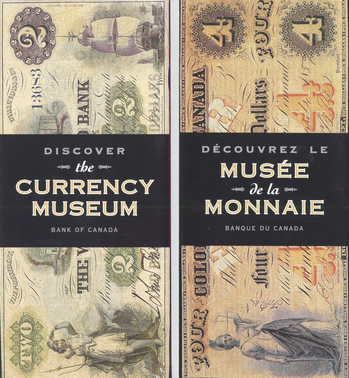
This brochure was designed to look like a bundle of old bank
notes, with the brochure header to look like a bank currency wrapper. And with
Canada being a bilingual country, the brochure has an English text on one side, and a
French text on the other side. This is a good example of theme design presentation.
Developing you brochure objectives.
The next step in our planning process is too clearly identify
exactly WHAT you want the brochure to accomplish - what are your objectives. I have found
that many (most) marketing brochures weren't planned with objectives - they were just
jammed with information. I use three kinds of objectives in my planning process. And
remember that objectives are "measurable".
Learning Objectives: With these objectives I like to quantify
the kinds of information that the brochure will present. For example: Upon reading the
brochure, the majority of tourist will be able to:
- List three benefits they will gain from visiting my attraction.
- Describe the main facilities that we have available for them.
- Understand our hours of operation, admission costs and services.
With these objectives listed the designer knows what content (and photos) will be required
to accomplish (or illustrate) these points.
Emotional Objectives: In marketing, these are the most
important. These are the objectives that will make a visitor "FEEL" that this
will be a great experience - that "I can't miss this!", or that "this site
or facility will be easy to get to - no trip stress". Emotional objectives are
accomplished mostly with the photos you select. Take a close look at the two brochure
covers - what emotions do they convey?
Behavioral Objectives: For your attraction these are the most
important objectives. These are the actions or behaviors you want the potential tourist to
do. Here are some examples:
- Potential tourists will come and visit our attraction.
- Tourists will go on our tours, eat their lunch at our site, buy souvenirs.
- Tourists will tell others about our attractions.
- Tourists will return for other visits.
The behavioral objectives will (might) be accomplished if the other emotional and learning
objectives do their job.
WHO?
The next step in the planning process is to clearly determine just who your attraction or
site target markets are. Here are some examples of "typical" target markets.
- Families on holiday with young children.
- Families on holiday with older children and teens.
- Families from the local community (high return visits).
- Foreign tourists.
- Older visitors (retired or with no children in the household).
- Retired individuals coming to your site by bus (coach tours).
- General tourists coming to your site by coach tour.
- School groups
- Tourists with special hobbies or interests (wildlife watching, hiking, skiing, visiting
historic homes, etc.
- Special groups or tours.
Of course these target markets can be further broken down into sub groups, but this gives
you the idea.
Your site or attraction will have a specific target market mix (year-round or seasonal)
that are most likely to want to visit your "kind" of facility or attraction.
Understanding this market mix helps you to identify:
- What photos to use in the brochure (you better have photos of the kinds of market groups
that you are trying to attract)?
- How your distribute your brochures.
- What kinds of services, events, or activities these market groups may be looking for?
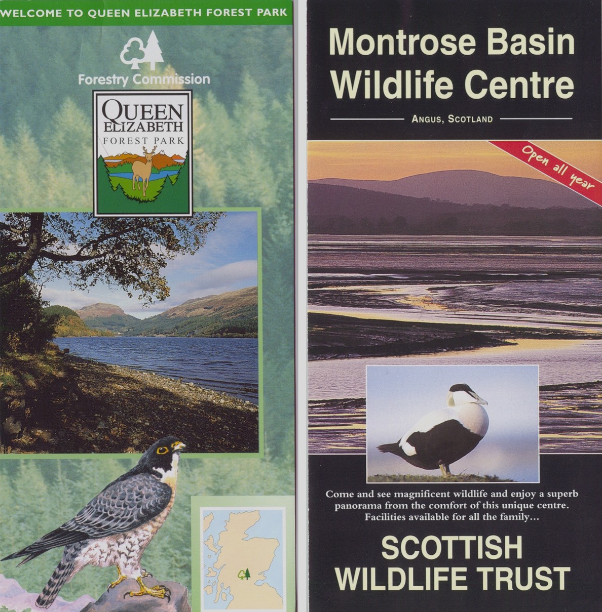
What market groups do you think the below attractions are most interested in?
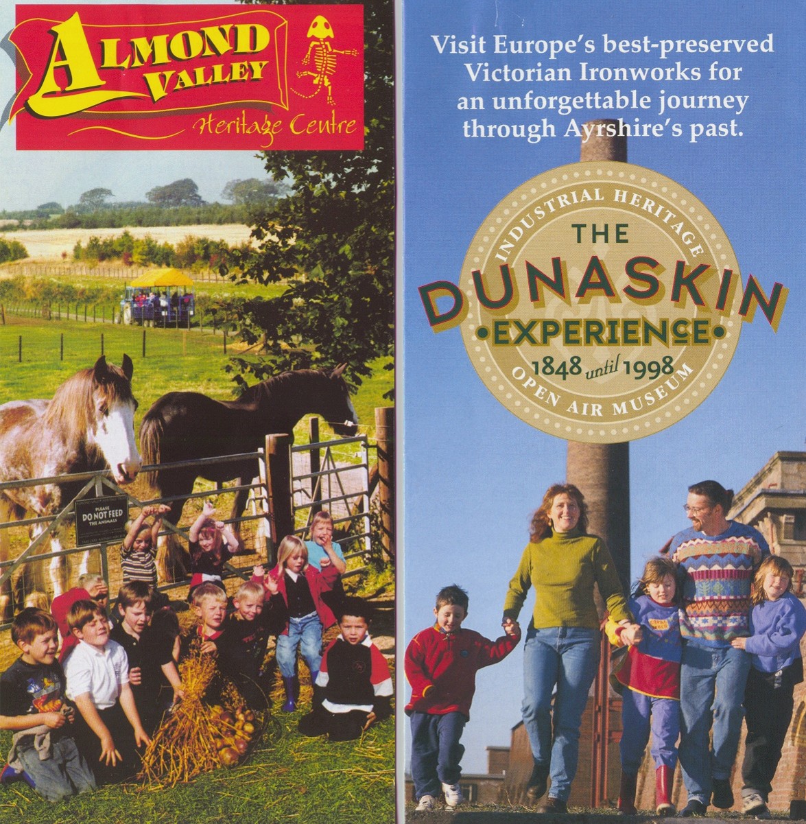
These two sites have a clear idea on the target markets that
they are trying to attract as their main market group, and effectively used the cover to
clarify this for potential visitors.
Can you tell what the emotional objectives of the cover design
might be? Is there a theme statement as to what the attraction is about? One
theme is presented in graphic form, the other in copy.
The interior of the brochure also needs to follow through with
this consideration of market groups and emotional objective illustrations.
The interior of this brochure gives visitors a good overview of
what the total site/experience might be. Photo insets show them the gift shop,
children's play area and food service. It is not over designed and in general a very
effective promotion piece.
Once you have a good idea of your theme or story presentation
needs, you have clearly outlined your learning, emotional and behavioral objectives for
the brochure, and have focused on the target markets your site is best suited for, or that
your want to work on attracting, the next step is in the mechanics of putting this
"plan" into action.
The Checklist (the "to do" list) for planning and designing successful
heritage tourism and interpretive brochures.
First Impressions - The Cover
� Can you tell within 5-10 seconds what the subject of this leaflet (attraction) is?
� Can you well within 5-10 seconds who the intended market group(s) is?
� Can you tell within 5-10 seconds what the site "offers" the visitor or market
group?
� Does the brochure header/design provoke attention or interest?
� Does the leaflet give you a general "oh my - this looks interesting!"
feeling?
� Does there appear to be "benefits" to the market group - reasons to pick up
and look at the brochure in more detail (open it up)?
Leaflet/Brochure Planning
� Are the objectives of the brochure clear (to you and the audience)?
- What information do you want your market groups to learn?
- How do you want them to feel about your site or attraction?
- What do you want the market group to do as a result of
reading your publication?
� Does the publication have a clear theme or central marketing message?
� Is your target audience clearly defined (who is in the pictures you are using)?
� How will you distribute your publication (this affects design, paperweight, etc.)?
- Mail out to potential visitors.
- Distribution via brochure rack. Remember that in most cases
only the top 1/3 of the brochure will show.
These three attractions (above) use the top 1/3 effectively to convey who they are. Cover
up bottom 2/3 of your current brochure if you have one. What does the top 1/3 convey to
your visitors?
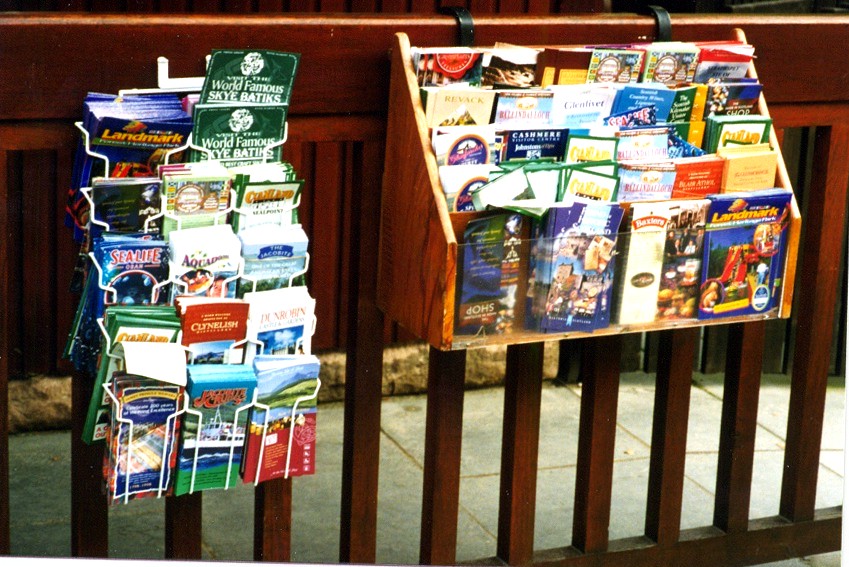
Your brochure can easily get lost in a "sea of
brochures" if you are not careful. The effective use of the top 1/3 becomes
more important when you consider where and how your final product will be made available
to the public.
� How will you evaluate the success of your publication (know that your stated objectives
are being accomplished)?
- You can pre-test draft brochures with test groups (some of your current visitors).
- Do response evaluation of your current brochures.
- Do audience observations at dispersal points.
- Analysis by an expert.
- Other evaluation methods.
The important thing to remember is to find out if the brochure is successfully conveying
the messages you want "BEFORE" you print and distribute thousands of them!
Brochure Design Mechanics
Point Site
Point size is the size of type you are using for your brochure. This is 12-point type, and
this is 14 point type. You want to use as large a point size as you can. This
may mean you have to edit your copy to get it to fit with a larger type.
� Is the point size used for your brochure appropriate for the target audience (i.e. if
it is to small, older visitors may have trouble reading it)?
� Get some examples of other brochures to look at (and learn from). What point size are
they using - can you easily read the copy?
Font
Font is the way the text letters look. For example, this text is "Times New
Roman". This is Antique Olive. This is Renaissance. You want to select the right font
to go with the correct massage illustration. Your designer can help with this too.
Some things to consider:
� Is the font easy to read? Would you want the total text in Renaissance?
� Does it support the theme (old font types for historic site brochures, more modern
fonts for science museums, etc.)?
� Are a variety of fonts used (and why)?
� What color should the font be printed in - do I need to have text in colors?
Brochure Folds
Another thing to consider is how you want your brochure folded. Here are some things to
consider:
� Is the design best suited for a open (no folds) or multiple folds (like a road map)?
� For larger publications, can the user easily re-fold the publication?
� Is the fold part of the overall "design" - help define topic areas?
This is an example for a more elaborate brochure fold.
Each of the three subject areas on the right open to a different information page, with
additional folds to each of those pages. Remember that you are paying your printer
for each fold. Some printers may only charge a few cents per fold, but with
thousands of brochures to be folded, this can add up!
Paper Selection
Another important area to consider is that of what kind of paper should we use to print
our brochure on? Here are more things to consider:
* Does the paper type used support the message/theme of the
brochure?
- What color paper should you use? Remember if you print photographs on color paper, the
"white" parts of the photo will now become the color of the paper and can
really ruin a photograph.
- What paperweight will you use? This has an impact if your brochure will be used in a
brochure rack like the one below.
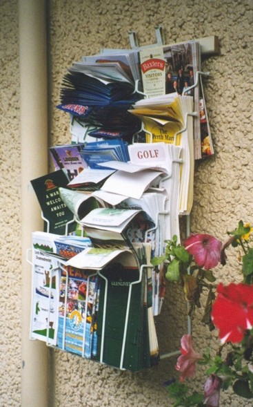
Notice how many of the brochures and leaflets are, what I like
to call, "weeping". They were printed on a lighter weight paper,
and when exposed to the elements (wind, humidity, etc.), bend over in this outdoor
brochure rack. The same will happen indoors too. So for display rack use you
may want to consider a stronger (heavier weight) paper to print them on.
Talk to your printer about paperweights and have them show you
examples. This might help make your planning job easier.
* Paper Texture
Like with the weight of paper, paper also comes in different textures. This can run from
enamel paper, like most color brochures are printed on, to special papers with lots of
textures (fibers) in them. Again, a printer can show you lots of different kinds of papers
to select from.
* Paper Finish
This is part of the paper texture selection, but needs to be considered. Remember that if
you are designing a brochure for outdoor use, like a site map or a walking tour, enamel
papers (with shiny finishes) reflect sunlight, and may be very hard to read outdoors. You
may want a flat finish (non-glare) paper for outdoor use.
* Does your type of paper then support the
publications intended use?
- Non glare for most outdoor use.
- Heavier weight paper for outdoor use (won't bend or blow easily in the wind).
- Lighter papers for mail outs or bulk mailings.
* Does the brochure use unique or
interesting die cuts to attract or focus the potential tourist's attention?
- Die cuts are an expensive brochure treatment, but can add to the "attraction
power" of the piece. A die cut is most simply, a cookie cutter for the paper that
cuts out designs. Here is a good example from St. Andrews Sea-life Center in Scotland.
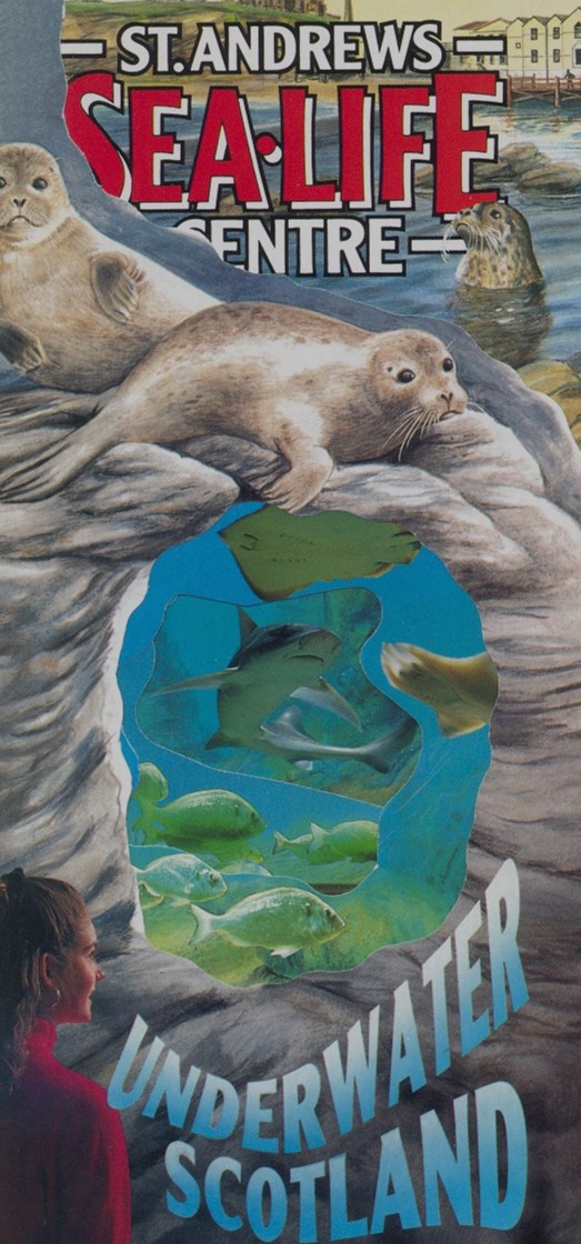
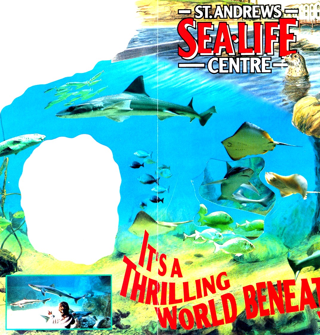
The Sea-life Centre brochure uses several die cuts. One for the large "hole" in
the center of the brochure right below the seal. When you open the brochure (right) you
can see the die cut. The next die cut is the top border, directly above the seal (and top
left in the open brochure to the right.
This particular brochure uses several more die cuts very effectively as you open the
brochure more. Again, die cuts can add to the expense of brochure publication, but can
also help in "attraction power" of the brochure as this one does.
Publication Copy/Text
Copy or text presentation is also an important part of the overall brochure design. To
much text (or all text) can overwhelm the potential visitor. Remember - they are not on
holiday to read lots of stuff. A good example of text or copy "presentation" is
shown below.
(Note: this scan didn't come out as well as I hoped, but I think that you can see the main
concept).
Notice that the copy does not overwhelm the layout. In particular, look at the
use of "bullets" to highlight information about the site, and the different
point sized used. I also like the use of captions with the photos.
Again, not to much text, just enough to let me know what I am looking at.
Here are some things to consider about your publications use of text:
� Is the copy written in short - provocative paragraphs?
� Does the copy address information that the visitors will need to or want to know?
� Can the visitors easily find the key information points?
� Is the copy written in an "interpretive" manner (provoke, relate, and reveal
information)?
� Is the copy written using active - colorful language?
� Does the copy "get to the point"?
� Does the copy use color text appropriately?
� Is the copy written in a simple - non-technical language? As a note, I write most of my
exhibit and publication copy at a 5th grade (about 10-12-year-old) vocabulary level.
� If technical terms are used, are they illustrated or defined?
� Are larger/bolder paragraph or topic headers used to help the reader find key points?
� Does the copy have "white space" around it?
� Is it written in an "editorial" or "speaking" style?
� Does it "leave the reader asking for more"?
� Does it properly prepare the potential visitor for the "promised" experiences
(are there restrooms, children's play areas, food services, etc.)?
Photos and Graphics
As you begin to draft out your brochure (or critique an existing one), it is important to
remember that:
Visitors remember:
10% of what they hear;
30% of what they read;
50% of what they see;
90% of what they do.
It is said that a picture is worth a 1000 words. The distressing point is that, if you
don't pre-test the pictures you use in your brochures, it can be the WRONG 1000 words!
A graphic assessment should consider:
� Size of photos or graphics used. One really good - large photo is better than lots of
small ones (below).
Of the three photos on this cover (above), which one(s) do you
think will get the target markets (visitors) attention? Which photo defines the
market group that this attraction is trying to connect with?
� Photo Composition - some important things to consider, many of which we have already
illustrated include:
- Who is in the photo (market groups)?
- What are the people in the photo doing? (Hope they are having fun or recreating in a
safe and stewardship-like manner.)
- How do "non-visitor" composition photos help you accomplish your objectives
(why do you have photos with no people in them?
There are times when "no people in the photos" might work. Particularly when you
are trying to keep control over the "numbers" of visitors, or what you are
marketing is the "getting away from people" experience. This approach is
attractive to very specific market groups. Can you name some market groups that this
brochure style would appeal to as in the above brochure examples?
- Will you need color photos, or will black and white do?
- Will the photos you selected "date you" if they are not updated regularly?
- Do the photos clearly illustrate the strengths of the site or facility?
- Do the photos clearly identify the site or facility?
The Photo Selection "self test".
Here is a little exercise you can do with an existing brochure. Cut out all of the
photographs out of the brochure, lay them out on a desktop, and mix them up. Then ask
staff members (or visitors) to see if they can tell you where the photos were taken (or
are they photos that "could come from anywhere", like a general lake photo, or
fall color photo?
This is a good example of the common use of photos/graphics as
"filler" or for decoration. This came from a brochure you have seen the
cover of (can you guess which one?).
� Graphic Assessments. Sometimes a graphic will work better than a photo, and can give a
better "interpretation" of the site or facility.
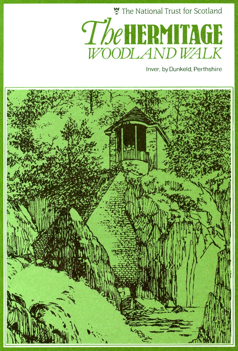
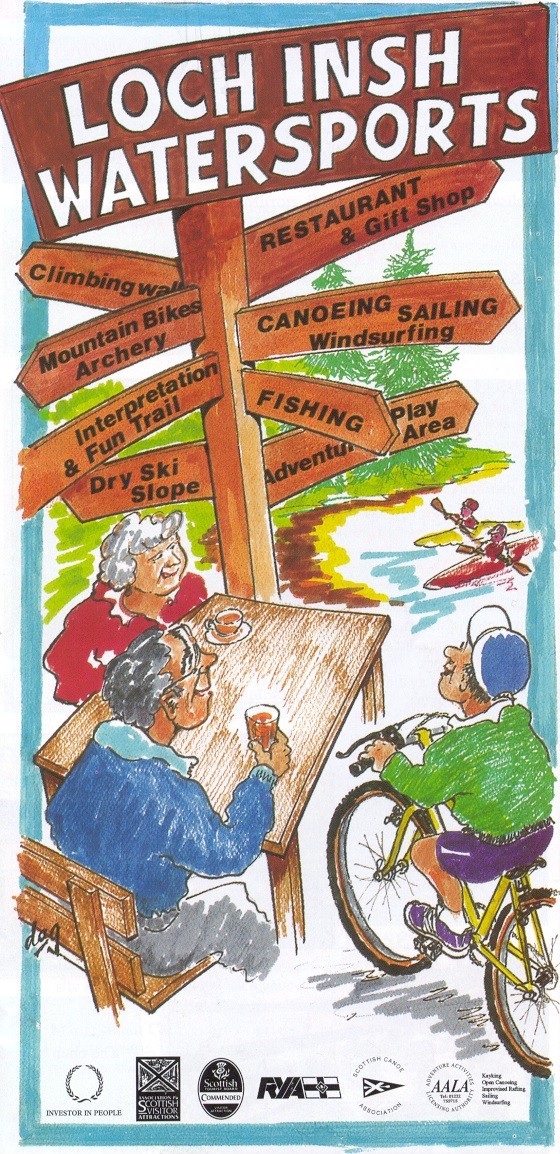
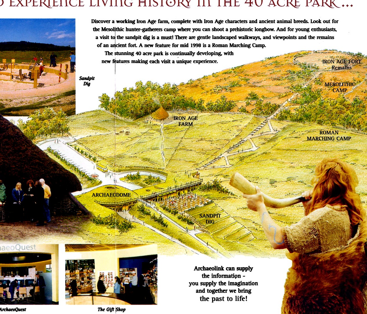
The two graphic examples above illustrate several points about the use of graphics. For
the publication on the left (the Hermitage) which I have visited, the use of the graphic
is OK, but the use of a good photo of the site would have been more powerful, and cost the
same to print. In the brochure on the right, the use of graphics here can illustrate the
complexity of the site (so many things to do), and note the "market group"
identification in the graphic as well, and is a good example of use of graphics instead of
photos.
More things to consider when using graphics:
- Do the support graphics clearly illustrate the theme, story or
concepts?
- Are graphics simple and easy to understand?
- Is the use of a graphic here better than the use of a
photograph?
- What size graphics should be used (look at objectives)?
- Is the graphic "visual information" market appropriate (will the user
understand and correctly interpret what they are seeing)?
General Leaflet/brochure Layout Assessment - Putting it all together.
___ Does the publication have attraction power and holding power?
___ Is the layout clean, simple, but yet powerful?
___ Is it clear as to the intent of the publication?
___ Can the user easily FIND needed information?
___ Have the BEST photos or graphics been selected (and pre-tested)?
___ Do the photos clearly illustrate the strengths of the site or attraction?
___ Do the photos clearly illustrate the intended market group(s) you want to attract?
___ Will the user be "inspired and motivated" to visit the site or attraction?
___ Can the user get the message mostly through visuals without having to read to much
copy?
___ Does the layout support the theme and objectives of the brochure?
___ Has the draft layout been pre-tested to see if "visitors like it" as much as
the person who designed it?
___ Is there "white space" to give the user visual breathing space?
___ Has the best type size and font, best paper size, color, texture, and weight been
considered?
___ Has the right design been used for the intended distribution and presentation method?
___ What shows on the top 1/3 of your brochure?
Psychology of the intended tourist/visitor.
Considering how visitors learn, remember and relate to your intended message:
- Have you given the potential visitor a reason to pick the brochure up?
- Can I clearly identify the target market group(s) your site is intended for? (Is your
site or attraction "for me"?)
- Can I list three benefits I (my family) will gain by visiting the attraction if this is
a marketing publication (three reasons I should visit you)?
- Are there photos with "people in them" that I can relate to?
- Do the photos illustrate the benefits I will gain by visiting the site/attraction?
- Are there clear directions as to how to find the site?
- Is there a usable map with landmarks I can look for (most visitors can't read typical
road maps)?
- Have you given me an overview of customer services available?
- I don't like to read - is the text short, provocative, interesting?
- I can't read text printed over graphics! You try it!
- I can't read text that is too small and don't like to look at "little" photos.
- Is there a creative design to get my attention?
- In general, have you taken the "risk" out of the visit to your site or
facility (I feel certain that I will get my money and time's worth from visiting you)?
Summary
In general, there are no "right" answers to creating successful brochures. There
are lots of right answers. The test is which ones will work best in helping you accomplish
your specific objectives for your unique target audiences.
This short guide is not "everything", but enough to get you started in looking
at your publications and helping to increase your chances of a successful brochure
marketing strategy.
For more information contact:
John Veverka
PO Box 189
Laingsburg, Michigan 48848
(517) 651-5441 FAX 651-2057
E-Mail: jvainterp@aol.com
Visit our web site at: http://www.heritageinterp.com