The two hardest questions for an exhibit designer/planner to ask and answer!
Believe it or not, many exhibits are planned and designed based on the
"interest" of the curator or staff, with little regard about the visitor
interest in the topic. Here are two questions I like to ask the exhibit planning
committees or designers when critiquing exhibits:
- Why would a visitor want to know this (information that the exhibit is presenting)?
If
you can’t think of reasons visitors would want to know this information – how
can you "provoke" them into looking at the exhibit and reading the copy?
- How do you want the visitors to USE the information the exhibit is presenting?
If you don’t want the visitor to use any of the information in the exhibit (or the
visitor can’t use any of the information), they why are you giving it to them?
The psychology of the exhibit – exhibit "load".
Exhibit load is the term I use to describe the amount of time and energy (either
physical or psychological) that each exhibit requires the visitor to use up in interacting
with that exhibit. Think of the visitor coming to a museum or interpretive center with
100% of enthusiasm, interest and energy when they first enter the exhibit area. As they
move through the exhibits they are "using up" energy and interest begins to drop
– they start to get psychologically tired and overloaded with information and
stimuli. And, usually within about 45 minutes, the visitor has had enough and heads for
the gift store or the lunchroom.
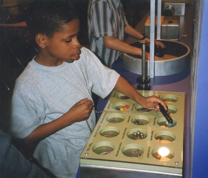
Usually the exhibits with the highest "load" are the interactive ones that
require mind and physical coordination – more thought process (and easier mental
fatigue), and the low load exhibits are the more passive ones, such as flat work graphics,
collections behind glass, paintings, etc.
The following exhibit classification matrix gives you one way to help determine the
general "load" of an exhibit.
Exhibit
Classification Matrix
exhibit
is active exhibit is inert
visitor is active
type 1
type
2a
visitor is passive
type 2b
type
3
Examples:
Type 1- The exhibit moves and the visitor moves – an
interactive exhibit like holding a live animal or a computer activity.
Type 2a - The visitor can so something but the exhibit is
inert, such as a hands on touch table or touching an animal skin.
Type 2b - The visitor is passive (just looks) while the
exhibit moves, such as watching a live animal in a zoo, looking at a video, watching
a model train run.
Type 3 - The visitor does nothing and the exhibit does
nothing back – looking at collections behind glass, looking at flat work
(photos, graphics), etc.
The idea here is that as the visitor goes from cell rank 1 to 2 to 3 there is generally
a decrease in the intrinsic interest they have in "those kinds" of exhibits.
Thus, more use of interpretive techniques are required for type 3 exhibits than type 1
exhibits. Research has shown that people are more interested in dynamic, animated,
changing stimuli than in inert flatwork. If you want to see this principle in action go to
any museum, sit in a corner, and "watch" the visitors.
The content can make a difference too. We know that visitors have a greater
intrinsic interest in real objects than in other forms, such as replicas:
Original objects in exhibits – High intrinsic interest
Replicas in exhibits – decreasing intrinsic interest.
Graphic Representations and Photos – even less intrinsic interest.
Verbal descriptions – almost no interest.
An example:
- Here in this glass case is Davey Crocketts Rifle – Imagine the adventures it’s
been a part of! With the real thing you can have a "time machine".
- Here in this glass case is a "replica" of Crocketts Rifle (hasn’t been
anyplace, done anything, no story).
- Here in this glass case is a very large photograph of Crocketts Rifle.
- Here is 1000 words describing Crocketts Rifle.
We have a decrease in intrinsic interest as we move from the "real thing" to
verbal descriptions.
The best plan of action I have found is to have a
diversity of exhibit load types presented in a purposeful pattern. For example, an exhibit
gallery might start with a type 2 exhibit or a type 3 exhibit, slowing building up to a
type 1 (hands on) exhibit. I usually recommend that the type 1’s are used to really
illustrate a key point or concept. Remember:
Visitors remember
10% of what they hear.
30%
of what they read.
50%
of what they see.
90%
of what they do.
I try not to have to many type 1’s as to many will tend to promote "exhibit
burn out" in the visitors and extreme sensory overload in children (taken you kids to
a science museum lately?). Usually I look at about 20% type 1’s, 50% type 2’s
and 30% type 3’s.
Remember also that type 1 exhibits will cost more than type 3’s.
You can use this concept to perk up exhibits. For example, if you had an exhibit on
Native American Stone Tools and had a bunch of them (originals) in a glass case for
children to look at, you would have a Type 3 exhibit. But if you had replicas of those
same stone tools that children could pick up and "try to guess how each was
used", you would have a more powerful Type 2a exhibit.
Hands on exhibits need "minds on" too.
One of the big problems I have with exhibits is where people can touch things, but
don’t know why they are touching it. Take "Touch Tables", for years a
standard in Nature Centers. So the child picks up a deer antler – then what? Exhibits
need to have "minds on" as well as hands on for any learning to take place. So
this exhibit could be enhanced by adding "Pick up the deer antler and see how many
tools you think you could make from it". Now the mind is focused on a mission with
the artifact and real learning can take place (assuming the child "wants to know
this").
Planning Interpretive Exhibits
In planning interpretive exhibits the element that is most important in the
planning process (but most often left out) is a clear understanding of what exactly you
want the exhibit to accomplish – its objectives. I would think that any
"interpretive" exhibit designer would require their clients to give them the
objectives for each exhibit – in writing! How can you design an exhibit if you don’t
know what that exhibit is to accomplish? And it is really difficult to do any real exhibit
evaluations without having the objectives in hand to evaluate against.
When planning interpretive exhibits I use three kinds of objectives for each and every
exhibit being planned:
Learning Objectives: those objectives that state just what you want the visitor to
learn, such as "Upon completion of interacting with this exhibit the majority of
visitors will be able to list three ways plants have been used for medicine. Another
example would be "upon completion of interacting with the exhibit the majority of
visitors will be able to describe the concept of "lift" in making airplanes
fly".
Behavioral Objectives: These are the objectives that address the question of
"how do you want the visitors to USE the information you (the exhibit) are giving
them". This is what you want to visitor DO! An example might be: "upon
completing interacting with the exhibit the majority of visitors will want to contribute
to preserving historic homes in some way". Another example: "the majority of
visitors will want to learn more about the history of the mound builders". The
behavior can be psychological as well, such as "want to become a member of the
museum/zoo" or "make more return visits to the facility".
Emotional Objectives: Emotional objectives are those that will have the most impact
on the visitors’ long term memory (and help accomplish the behavioral objectives).
They are important for the exhibit designer as they help direct the colors, graphics,
photos, music, etc. to be used to create a certain mood or feeling. Some examples:
"upon completion of the exhibit contact the majority of visitors will feel a sense of
sadness about children working in the coal mines of Wales." "Upon completion of
the exhibit contact the majority of visitors will feel an increased need to quit
smoking." "Upon completion of the exhibit contact the majority of visitors will
feel a greater sense of community (local history) pride". Have fun learning can be an
objective too.
You see these objectives in use everyday! These same objectives are used in
developing almost every advertisement you see in print or on TV! These are basic
marketing/advertising objectives. Think of each ad in a magazine as a miniature
"exhibit". The ad wants the viewer to learn something (why you need this
product), have you "feel" something (you will be better off with this product),
and do something (buy the product).
When you finish writing your exhibit objectives, review the two questions: 1) why would
a visitor want to know this and 2) how do you want the visitors to use the information?
Once you have your objectives done – the exhibit is almost done. The rest of the
planning and design process is essentially how to best accomplish the objectives (what
graphics, text, photos, music, interactive activity, etc.).
What do Exhibits Cost?
Here are some "rules of thumb" in trying to determine your exhibit budget
for "new" exhibit projects:
So if you had $1.00 for your exhibit budget, .25 cents would go do design, and .15
cents to delivery and installation. So there is about .60 cents left to buy exhibit stuff!
If you decide to do one contract for "design" and a different contract for
"construction", you can probably add another 10% to the design costs for the
preparation of "bid" or "construction" documents.
The average time you should allow for most new exhibit projects (depending on the size
of the project) is about 9-12 months for planning and design and another 9-12 months for
construction and installation.
Cost/contact and cost effectiveness of exhibits.
The evaluation of your exhibits is really very important. I like to look at the
"cost per contact" and cost effectiveness of exhibits.
Cost per contact is how much it costs you each time a visitor uses the exhibit over
the projective "life" of the exhibit. So for example if an exhibit cost $100.00
to build, and over 3 years 100 visitors looked at or used the exhibit, the cost per
contact was $1.00.
Cost effectiveness is what you get in return for your cost per contact. So with the
above example if you spent $1 per contact, are you getting $1 or more in benefits from
that contact? Are your objectives being accomplished at whatever minimum success level you
wanted (70% of the visitors….)?
I have seen some exhibits that cost thousands of dollars in museums and interpretive
centers that visitors hardly ever look at, read, or interact with. When you figure the
cost/contact and cost effectiveness (thousands being spent to accomplish very little or in
some cases "nothing") it can be a very sobering moment! I have also seen some
exhibits in interpretive centers done with poster board, a few artifacts, and a lot of
"creativity" that cost very little, and are very successful in accomplishing
their objectives. Low cost per contact, and very "cost effective". The point
here is that the amount of money spent on exhibits does not automatically make them
"successful" or cost effective.
The visitors and exhibits
Over the past 20 years of doing interpretive exhibit planning and evaluation there are
some "truths" that I have observed (most backed by research). Here are a few:

